
Senior Home Safety & Near-Vision Accessibility
Fire Extinguisher Labeling Tipsfor Seniors With Poor Near Vision
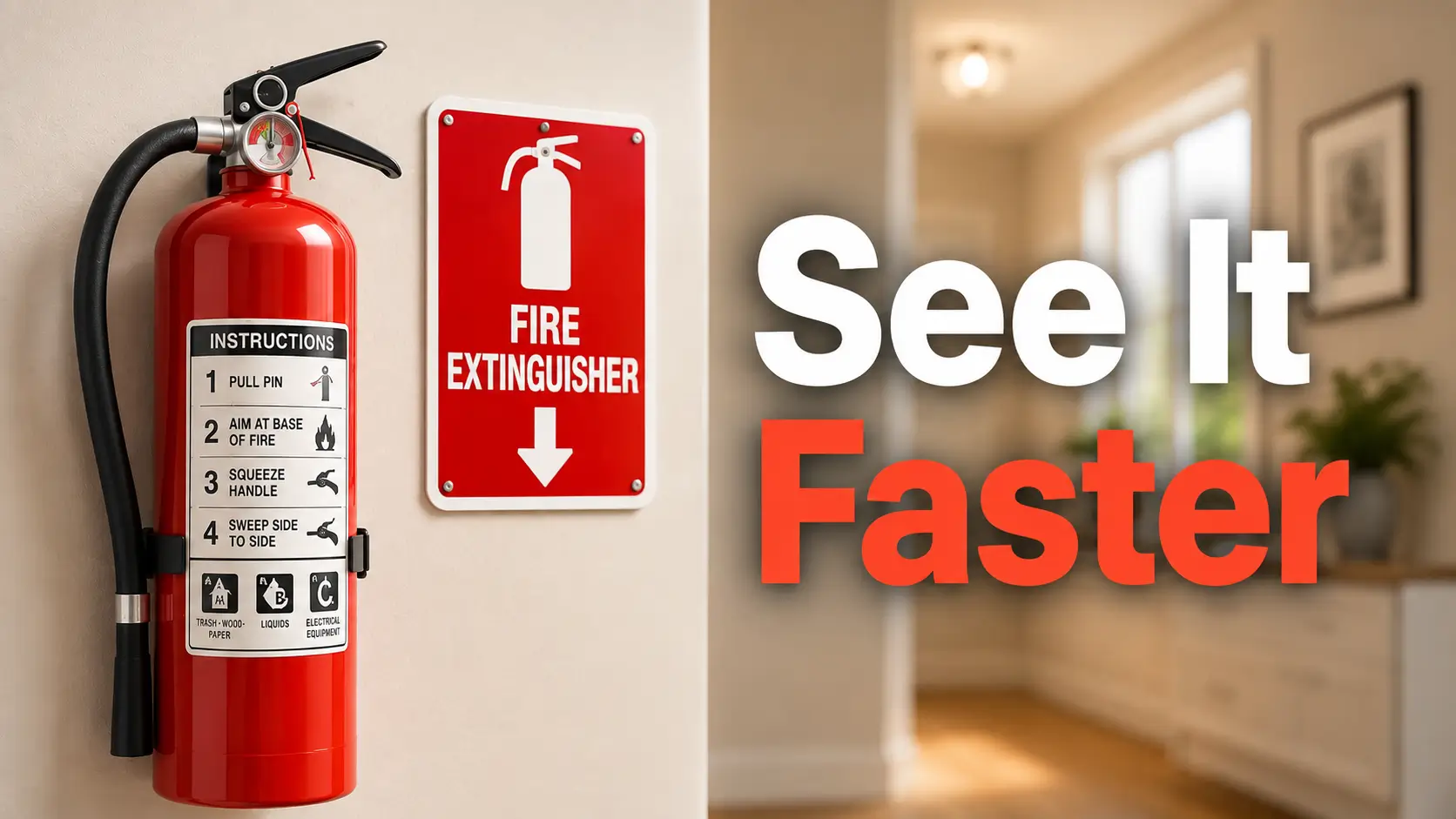
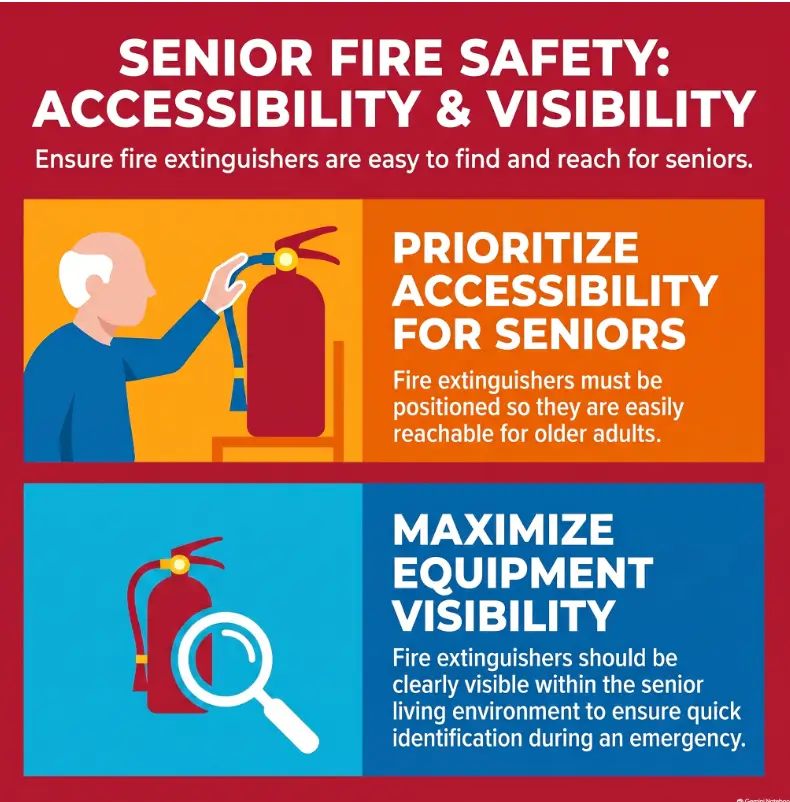
A fire extinguisher can be mounted in exactly the right place and still become strangely invisible when its lettering is tiny, glossy, crowded, or hidden in a shadow. For an older adult whose near vision has changed, the problem is often not knowing that extinguishers exist. It is recognizing the right object quickly enough, from the distance where an emergency actually begins.
The fix is not to redesign the extinguisher or paste a homemade instruction manual over it. A safer accessibility approach is much simpler: preserve every original operating instruction, classification, gauge, warning, and service marking, then add a separate visual cue that makes the extinguisher easier to locate and identify.
This guide shows caregivers, adult children, and seniors aging in place how to think about large print, contrast, glare, viewing distance, room-to-room consistency, and the crucial line between helpful supplemental labeling and hiding information that belongs on the extinguisher.
The goal: make the extinguisher recognizable before anyone needs to squint, search for reading glasses, or decode a wall of tiny print. 🔥
Snapshot
This guide is for seniors with reduced near vision and the people helping them make a home easier to navigate. You will learn how to add readable supplemental extinguisher cues, what information never to cover, how to compare simple labeling options, and how to run a five-minute visibility test before an emergency ever happens.
Table of Contents
Before You Act: Labeling Helps, but Escape Comes First
This article is about making an existing fire extinguisher easier to locate and recognize. It is not a substitute for the extinguisher manufacturer’s instructions, local fire-code requirements, professional fire-safety advice, or an individualized evacuation plan.
The U.S. Fire Administration advises that portable extinguishers are intended for small fires under appropriate conditions, and that people should have a clear escape route rather than allowing a fire to come between them and the exit. If smoke is heavy, a fire is growing, someone is unsure what to do, or fighting the fire would delay evacuation, getting out is the priority.
BEFORE YOU ACT
Do not let an accessibility sticker become a safety sticker. Supplemental labels should help someone find and identify an extinguisher. Confirm extinguisher type, placement, maintenance, and operation from the original labeling and appropriate fire-safety guidance. When a senior has significant vision, mobility, memory, or dexterity limitations, consider reviewing the full escape plan with a local fire-safety professional or qualified accessibility specialist.
Think “recognition aid,” not “replacement instructions”
A supplemental label might simply say FIRE EXTINGUISHER in large print. A nearby wall sign might add a directional arrow. That is very different from covering the manufacturer’s nameplate with enlarged homemade operating steps.
This distinction keeps the project modest, inexpensive, and much less likely to interfere with information that matters.
Do not turn ownership into an obligation to fight a fire
An easy-to-see extinguisher is useful preparation. It does not mean a senior should remain in a dangerous room to use it. Fire conditions can change much faster than a quiet kitchen walkthrough suggests.
For households adapting multiple areas for aging vision, this project belongs inside a broader home safety checklist for seniors, alongside lighting, exits, trip hazards, smoke alarms, and other everyday accessibility issues.
Bigger Isn’t Enough: What Makes a Label Readable?
Large letters can still disappear
Imagine two labels with identical 30-point lettering. One uses dark, plain text on a matte white surface. The other uses gray script on shiny silver vinyl beneath a kitchen spotlight.
Technically, both have “large print.” Functionally, they live on different planets.
Readable emergency identification depends on several ingredients working together: character size, simple letter shapes, spacing, contrast, surface finish, lighting, placement, and viewing distance. If one ingredient goes badly wrong, making the type slightly larger may accomplish surprisingly little.
Build the label around one emergency question
The strongest supplemental label usually answers one question: What is this?
That means “FIRE EXTINGUISHER” can be more useful than a sticker packed with five operating steps, four warnings, an arrow, a phone number, and three little icons competing for attention.
If the extinguisher itself is hidden beside a cabinet or around a corner, a separate directional sign may answer the second question: Where is it?
Try the three-second recognition test
Stand at the normal entrance to the room. Do not move closer. Do not put on reading glasses just for the test.
- Can the senior locate the extinguisher area within about three seconds?
- Can they identify that the object is a fire extinguisher?
- Can they do it without leaning forward?
- Does the cue remain visible when a cabinet door is open?
- Does ordinary room lighting create glare?
If the answer is no, change the environment before automatically buying a more elaborate label.
Key Takeaway
A good supplemental label does not win a typography contest. It wins a recognition test from the place where the person will actually see it.
Contrast First: Give Aging Eyes a Cleaner Signal
Dark-on-light or light-on-dark beats décor camouflage
Emergency labels are one of the rare places where “subtle” is usually not a compliment. Pale gray on ivory may look elegant beside the backsplash, but an emergency cue should not require careful inspection.
The accessibility principles in U.S. Department of Justice ADA design standards emphasize visual characters that contrast with their background and non-glare finishes. Those standards apply in specific accessibility contexts rather than serving as a household fire-extinguisher labeling rule, but the underlying visibility principles are useful when designing a supplemental home cue.
A simple starting point is black lettering on white or another very light matte background, or white lettering on a dark matte background. You do not need to chase one supposedly perfect color combination for every older adult.
Glossy labels can become tiny mirrors
Glare has a talent for arriving exactly where you wanted to read. A glossy sticker placed under an overhead light may reflect a bright patch across several characters. Moving six inches sideways can suddenly make the wording visible again.
For a household already struggling with shiny surfaces, the same practical principles discussed in this guide to matte versus glossy surfaces for aging eyes apply here too: control reflected light rather than assuming more brightness always means better visibility.
Do not make color carry the whole message
Color can reinforce recognition, but it should not be the only clue. “Use the blue one” is fragile information if lighting changes, colors look similar to the user, or another family member interprets the system differently.
Words and simple symbols should still carry the meaning.
The C-D-S-A Visibility Framework
Distance Changes Everything: Test From Where You Stand
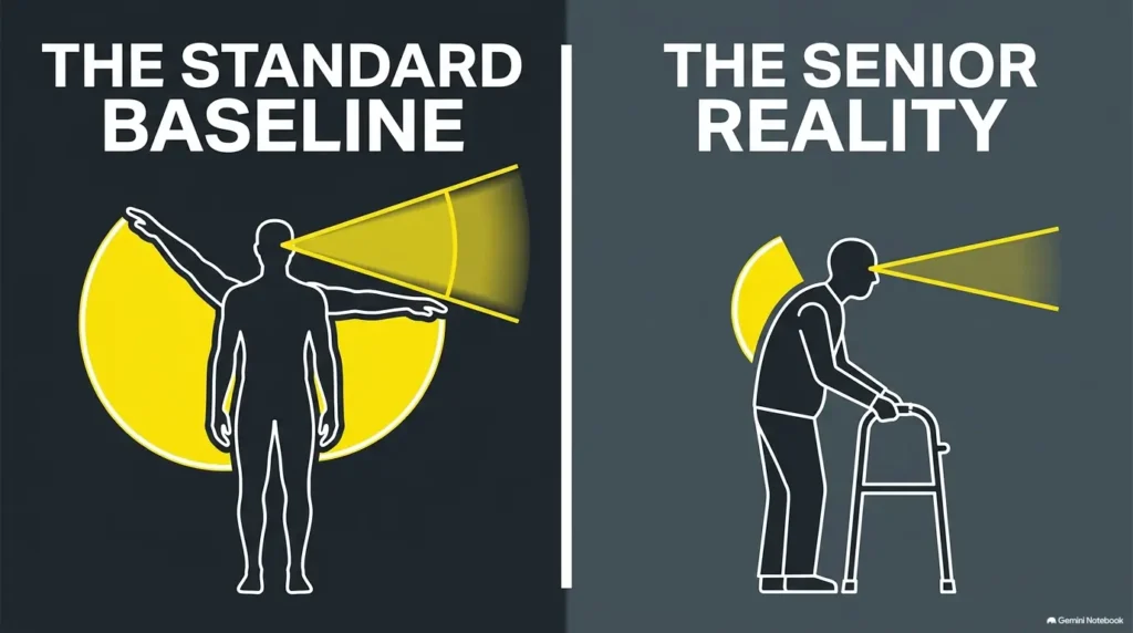
Near vision is the wrong benchmark
Many accessibility projects accidentally begin with someone holding a freshly printed label inches from their face and saying, “That looks easy to read.”
Unfortunately, the extinguisher will not be held like a paperback novel. A person may first see it from a kitchen doorway, across a garage, or several steps down a hallway.
The practical question is therefore not “Can you read this label up close?” It is “Can you recognize the important message at the installed viewing distance?”
Test from the doorway, not beside the label maker
For each extinguisher, identify two or three realistic viewing points. In a kitchen, that might be the doorway and the end of the counter. In a garage, it may be the door from the house and the normal parking position.
Then test the cue at those points under ordinary lighting. If identification depends on walking within inches of the extinguisher, the system is solving the wrong problem.
Location is part of the label
A spectacular label behind a hanging coat is still behind a hanging coat.
OSHA’s workplace inspection guidance, while not a household labeling rule, illustrates a sensible general principle: extinguishers should remain readily visible and unobstructed, with operating instructions legible and facing outward. In a home, the same practical check can reveal cabinets, stored boxes, furniture, shadows, or open doors that compromise visibility.
| Test Point | What You Are Checking | Possible Fix |
|---|---|---|
| Room entrance | Can the extinguisher area be spotted quickly? | Add a larger nearby identification or directional cue |
| Normal walking path | Is text readable without leaning closer? | Increase size or improve contrast |
| Lights on | Does reflected light wash out the wording? | Choose matte material or change angle |
| Lights low | Does the location disappear into shadow? | Improve safe ambient lighting or reposition the cue |
| Cabinet or door open | Is the extinguisher hidden? | Move the cue or eliminate the obstruction |
Use Two Layers: Find It Before You Read It
Layer one says, “Here it is”
The first layer is environmental. It should be visible before anyone is standing beside the cylinder.
Depending on the installation, that could mean a simple wall-mounted sign immediately above the extinguisher or an uncluttered directional cue where the extinguisher cannot be seen from the main approach.
Keep the wording boring in the best possible way: FIRE EXTINGUISHER. Emergency identification is not the moment for clever abbreviations.
Layer two preserves the official details
The second layer is the extinguisher’s own labeling. This is where classifications, operating instructions, warnings, and other manufacturer information belong.
Extinguisher classifications indicate the kinds of fires for which the unit has been approved. Homemade color codes or household nicknames should never replace those official markings.
Fewer words can be safer
A supplemental label should reduce visual competition, not create another dense reading assignment. If your first draft contains a paragraph, shrink the message before shrinking the font.
Key Takeaway
Find it first, read official information second. The supplemental cue should guide recognition. The extinguisher’s original labeling remains the authority for its classification and operation.
Real-world example: the label that got shorter
A daughter helping her father reorganize the kitchen notices that he can read newspapers with glasses but rarely wears them while cooking. The extinguisher sits beside a pantry door.
Her first idea is an oversized sticker explaining how to use it. The draft has six lines, an arrow, two symbols, and a reminder about calling emergency services.
During a doorway test, her father cannot read any of it. They replace the concept with a matte wall cue containing two large words: FIRE EXTINGUISHER. Nothing is attached over the manufacturer’s label. The original gauge, pin, instructions, and classification remain visible.
The lesson is wonderfully unglamorous: the useful part was not adding more information. It was removing the information that did not belong in the identification layer.
Don’t Cover These: The Shortcut That Can Backfire
Keep the manufacturer’s operating information visible
Do not paste accessibility material across the extinguisher’s nameplate or operating directions. If the original printing is difficult to read, that is a reason to improve pre-emergency familiarity and environmental identification, not erase the original information.
Keep the fire classification visible
A household may own extinguishers designed or rated for different hazards. Official markings matter because an attractive homemade icon does not change what the extinguisher is approved to handle.
Keep controls, gauges, pins, seals, and service information accessible
An added band, sleeve, sticker, or tag should not interfere with the handle, safety pin, tamper seal, pressure gauge when present, hose, nozzle, mounting arrangement, maintenance information, or inspection access.
The U.S. Fire Administration also advises consumers to look for appropriate listing or certification labeling when selecting an extinguisher. Supplemental decoration should never make those original markings harder to find.
| Area | Cover It? | Why |
|---|---|---|
| Large empty wall space above extinguisher | Potentially suitable for a separate cue | Can improve identification without altering equipment |
| Manufacturer instruction panel | No | Operating and safety information should remain readable |
| Fire classification markings | No | Identifies approved fire types |
| Pressure gauge | No | Must remain visible where applicable |
| Pin, seal, handle, hose, nozzle | No | Do not interfere with controls or readiness |
| Inspection or service tag | No | Maintenance information should remain accessible |
Show me the nerdy details
There is an important distinction between equipment labeling and environmental wayfinding. The extinguisher carries information about the equipment itself: classification, operation, warnings, certification, and servicing. A household accessibility cue serves a different job: helping a person find or recognize the equipment.
Separating those functions is useful because you can enlarge the environmental message dramatically without rewriting technical information. The result is a cleaner visual hierarchy: large cue first, original equipment information second.
Kitchen, Garage, Hallway: Build One Visual System
Standardize what can be standardized
If a home has multiple extinguishers, avoid giving each location an entirely different design language. Familiarity itself becomes an accessibility tool.
- Use the same core wording.
- Use the same typeface family.
- Use similar letter proportions and spacing.
- Use the same high-contrast visual treatment.
- Place environmental signs in a consistent relationship to the extinguisher where practical.
A senior should not have to learn one visual code in the kitchen, another in the garage, and a third near the bedrooms.
Let location cues do the differentiating
If a directional sign is needed, plain wording such as “FIRE EXTINGUISHER” with a clear directional cue usually beats creating color-coded household categories that could be mistaken for official extinguisher classifications.
Icons help most when words stay nearby
A familiar extinguisher symbol may speed recognition, particularly in a shared home. But icons can be interpreted differently, and visual acuity changes which details remain recognizable.
Pair simple imagery with plain-English words rather than forcing a symbol to carry the whole message.
The same principle appears in many everyday aging-in-place adaptations. When helping an older parent with close-up reading, a consistent visual system often works better than repeatedly handing them one more isolated workaround. This guide to helping an aging parent with presbyopia explores that broader approach.
Key Takeaway
Consistency quietly does part of the cognitive work. When every extinguisher location uses the same visual grammar, the household is learning one system instead of several.
Common Labeling Mistakes and Better Alternatives
Mistake #1: shrinking five instructions onto one sticker
If a sentence is important enough to read during an emergency, making it miniature does not rescue it. Keep the accessibility cue focused on recognition and rely on approved instructions and prior training for operation.
Mistake #2: choosing a decorative typeface
Plain letterforms, open shapes, generous spacing, and strong strokes generally outperform ornate lettering for fast reading. If you are choosing text size for several senior-friendly labels around the home, the guide to font size for seniors can help you think beyond a single universal number.
Mistake #3: buying the fanciest label before testing paper
You can test most of the visual design for almost nothing. Print several versions on ordinary paper, tape them temporarily near the extinguisher, and test them from realistic distances.
Only after the wording, size, location, and contrast work should you decide whether a more durable matte label, rigid sign, professional printing, or other finished option is worth paying for.
Mistake #4: assuming more expensive means more readable
Premium materials may offer durability, cleaner printing, or easier mounting, but none automatically fix poor placement or cluttered wording. A ten-cent paper mock-up with excellent hierarchy can outperform an expensive glossy plaque with weak contrast.
| Setup | What It Includes | Best For | Watch For |
|---|---|---|---|
| Good | Temporary high-contrast paper test | Checking wording, size, and sightlines before spending | Not intended as a durable final installation |
| Better | Simple matte printed cue with consistent home-wide design | Most aging-in-place households | Confirm mounting does not hide equipment or official information |
| Best for complex needs | Environmental review plus professionally produced cues where appropriate | Significant low vision, complicated layouts, or multiple accessibility needs | A label alone may not solve navigation, mobility, or evacuation problems |
When professional help is worth considering
A DIY label may be completely adequate for mild near-vision difficulty. Consider more specialized help when the senior cannot reliably locate the extinguisher even after contrast, lighting, and placement are improved, or when visual impairment occurs alongside mobility, cognition, hearing, or dexterity limitations.
A low-vision rehabilitation professional or occupational therapist may be able to evaluate environmental accessibility more broadly. Your local fire department may also offer community fire-safety education or guidance on home escape planning. Ask what services are available locally rather than assuming a paid consultation is necessary.
The U.S. Fire Administration specifically encourages people with disabilities and their households to build fire-prevention and escape planning around individual abilities.
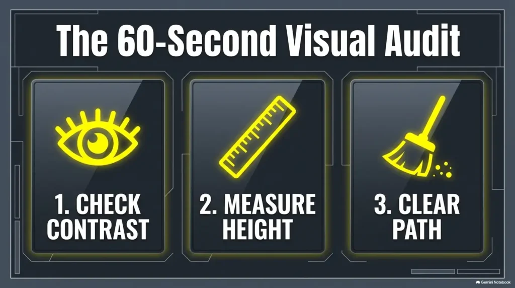
Before an Emergency: Run a Five-Minute Visibility Check
Minute 1: stand where trouble would first be noticed
Walk to the doorway, hallway, or normal approach point. The extinguisher should not receive special treatment just because you know exactly where it is. Ask the senior to identify the location without prompting.
Minute 2: test without close-up correction
If the person normally uses reading glasses only for mail, menus, or books, run the first test without them. You are checking whether the main identification cue works in ordinary life.
Minute 3: change the lighting
Turn on normal kitchen or hallway lighting. Check daylight from windows. If appropriate and safe, observe the location under lower evening illumination too.
You are hunting for glare, bright reflections, deep shadow, and competing objects that steal visual attention.
Minutes 4 and 5: inspect access and official information
- Confirm the extinguisher itself is not buried behind household storage.
- Confirm the supplemental cue is easy to see.
- Confirm original instructions and classifications remain visible.
- Confirm the gauge, pin, seal, handle, hose, and nozzle are unobstructed where applicable.
- Confirm service or inspection information remains accessible.
- Ask whether the senior can describe the escape route from that location.
Key Takeaway
Stress reduces the patience available for reading. Design the home for hurried recognition now, while everyone is calm enough to notice awkward sightlines and tiny lettering.
NFPA also emphasizes that portable extinguishers are for relatively small fires and should be part of broader home fire safety, not treated as a substitute for escape planning.
FAQ: Fire Extinguisher Labels and Poor Near Vision
How large should fire extinguisher label text be for seniors?
There is no single household font size that works for every person and every viewing distance. Size should be tested together with contrast, spacing, lighting, glare, and distance. A label several feet away generally needs to be designed differently from one intended for close reading.
Instead of chasing a magic point size, print several versions and test them at the actual installation location.
Can I put a larger homemade label on a fire extinguisher?
A supplemental identification cue may be useful, but avoid covering or interfering with manufacturer instructions, classifications, warnings, certification markings, gauges, controls, inspection information, or service tags. A separate nearby sign is often simpler than trying to redesign the extinguisher itself.
What colors are easiest for seniors to read?
Strong contrast matters more than picking one universal “senior color.” Dark text on a light background or light text on a dark background provides an intuitive starting point. Test the combination with the actual person, lighting, and viewing distance.
Should I use pictures instead of words?
Simple, familiar symbols can support recognition, but words should usually remain nearby. An icon alone may be ambiguous, particularly when seen from a distance or under stress.
Can I label different extinguishers with different colors?
Color can be a secondary household cue, but do not let color replace official extinguisher classifications or clear wording. Someone entering the home should not need to know a private color code before understanding the sign.
Where should the large-print label go?
Choose a location visible from the normal approach path without blocking the extinguisher’s official information or controls. A nearby wall sign may work better than placing another sticker directly on the cylinder.
What if the senior still cannot read the instructions?
Do not keep enlarging supplemental instructions indefinitely. If substantial vision loss prevents safe recognition or use, broaden the plan. Review extinguisher placement, home lighting, smoke alarms, escape routes, assistance needs, and whether the person should be expected to operate an extinguisher at all.
For broader visual support, compare low-vision tools for seniors and consider professional low-vision rehabilitation when ordinary reading adaptations are no longer enough.
Should seniors practice before an emergency?
Household walkthroughs are valuable. Practice locating the extinguisher, recognizing the official instructions, identifying exits, and discussing when evacuation is the safer choice.
Do not discharge, remove safety devices, or otherwise tamper with an extinguisher merely for informal household practice. If hands-on instruction is desired, look for appropriate fire-safety training in your community.
Make One Extinguisher Pass the Three-Second Test Today
You do not need to redesign the entire house this afternoon. Choose the extinguisher closest to a high-use living area and give yourself 15 minutes.
- Stand at the normal entrance to the room.
- Ask whether the extinguisher can be located within about three seconds.
- Check whether its purpose can be recognized without close-up reading.
- Look for glare, shadows, furniture, cabinet doors, or stored objects that interfere with visibility.
- Create a temporary large-print, high-contrast identification cue if needed.
- Place the cue nearby without covering official extinguisher information or controls.
- Repeat the test from several feet away.
- Finish by reviewing the exit route rather than stopping at the extinguisher.
If the first version fails, that is useful information. Make the words larger, simplify them, increase contrast, reduce glare, or move the environmental cue. A failed paper test costs almost nothing. Discovering the same problem during smoke and confusion is a very different bargain.
The deeper idea is simple: accessibility is rarely about forcing aging eyes to work harder. It is about making the environment ask less of them.
Your 15-minute next step
Pick one extinguisher. Test it from the doorway. Change only what improves recognition, and leave every official marking and control alone. Then walk the escape route. That small rehearsal turns a red cylinder on the wall into part of a usable safety system.
Last reviewed: 2026-09