

Senior Kitchen Visibility Guide
How to Mark Liquid Measuring Lines for Seniors
with Presbyopia
A measuring cup should not become a tiny courtroom where every ounce must defend itself under bad kitchen lighting. Yet for many older adults with presbyopia, clear plastic, pale blue marks, steam, glare, and little etched lines can turn one simple pour into a guessing game.
The goal is not to make the kitchen look like a laboratory. The goal is gentler and more useful: one bold fill line, one clear number, one repeated task made easier. A good marking system helps with hydration, coffee, soup, meal prep, oral rinse, and everyday measuring without turning the counter into a wall of labels.
This guide shows how to choose the right measurements, pick senior-friendly materials, avoid unsafe food-contact markings, compare DIY and paid options, and know when a pharmacist, eye doctor, or occupational therapist should be part of the decision.
Read faster
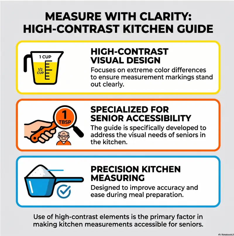
Use thick, high-contrast marks instead of faint tick lines.
Reduce errors
Mark only the daily-use amounts that actually matter.
Stay safer
Keep DIY markings outside food-contact surfaces whenever possible.
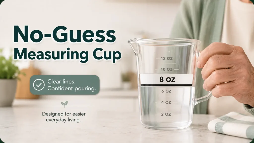
Simple promise: build one “no-guess” measuring cup that works in the real kitchen, under the real light, with real hands. 🧃
Snapshot
This article is for seniors with near-vision blur, family caregivers, home health aides, and anyone adapting a kitchen for easier measuring. You will learn how to mark liquid measuring lines with better contrast, safer placement, fewer labels, and a quick real-use test before trusting the system.
Table of Contents
Before You Act: What This Guide Can and Cannot Do
This guide is for household visibility and accessibility. It can help with water, coffee, soup, cooking liquids, oral rinse cups, meal-prep pitchers, and similar everyday tasks.
It is not medical dosing advice. If a liquid medication, insulin supply, prescription syrup, feeding-tube formula, thickened liquid plan, or clinical nutrition product is involved, ask a pharmacist, clinician, or occupational therapist before changing the measuring tool.
Before You Act
A bright line can reduce confusion, but it should never replace professional instructions for dosing, swallowing safety, diabetes care, tube feeding, or medication management. When the amount affects health, confirm first.
For general eye-health background, the National Eye Institute’s information on presbyopia is a useful plain-English resource. If vision seems suddenly worse, do not treat the measuring cup as the main problem. Treat the vision change as the headline.
Start With the Real Problem, Not the Measuring Cup
Presbyopia Turns Tiny Lines Into Kitchen Static
Presbyopia makes close-up focus harder with age. In the kitchen, that often shows up as a practical nuisance: small measuring lines look faint, numbers blur together, and clear containers become strangely unhelpful.
The trouble gets worse when the cup is transparent, the liquid is clear, the markings are pale, or the person is reading under a cabinet light that throws glare across the surface. The result is not just inconvenience. It is a little fog bank sitting between the hand and the correct amount.
If the senior also has cataracts, low contrast sensitivity, hand tremor, memory changes, arthritis, or fatigue, the task becomes harder still. This is why the best fix is not simply “make the label bigger.” Bigger helps. Contrast, placement, lighting, and routine matter just as much.
“Almost Right” Is the Hidden Risk
In cooking, almost right may only mean thin soup or strong lemonade. In hydration routines, it may mean the person drinks less than intended. In cleaning, it may mean a solution is mixed too strong. In medication dosing, almost right can matter more than anyone wants it to.
That is why the measuring system should be designed around repeated real-life use, not a perfect countertop demonstration. The test is not whether the mark looks good when you apply it. The test is whether the person can use it tomorrow morning, after a poor night’s sleep, with the kettle hissing and the phone ringing.
The Best System Is Not the Prettiest One
A beautiful measuring cup with tiny minimalist marks may look calm in a product photo and behave like a little optical prank at 7 p.m. Seniors do not need kitchenware that wins a design award and loses the plot.
The best marking system is the one that can be read quickly, repeatedly, and without guessing. Think less “elegant label” and more “reliable landmark.” A thick line that says 8 OZ WATER may not be glamorous, but it can be a tiny act of household mercy.
Key Takeaway
Do not start by buying five gadgets. Start by identifying one repeated liquid task that causes squinting, hesitation, spills, or second-guessing.
For a wider look at near-vision changes, see this related guide on near vision problems in seniors.
Pick the Line First: Which Measurements Actually Matter?
Mark Only the Daily-Use Amounts
The first rule is wonderfully unfancy: do not mark everything. Mark what the person actually uses.
Common daily-use amounts might include 4 ounces for a small drink, 8 ounces for hydration, ½ cup for meal prep, 1 cup for cooking, or a specific pitcher level used for coffee or tea. The right mark is not the one a manufacturer prints. It is the one the person reaches for again and again.
For family caregivers, this is where observation beats assumption. Watch the routine. Which cup gets used? Where does the person stand? Which line creates the most squinting? That is the first target.
Fewer Lines Reduce Visual Noise
Too many marks create the zebra-crossing problem: technically detailed, practically confusing. A cup covered in ounces, cups, milliliters, and homemade labels may become slower than the original.
For seniors with presbyopia, cataracts, or low contrast sensitivity, simplicity is a safety feature. One or two bold marks often work better than a full measurement ladder.
Three-Second Test
After you mark the container, place it where it is normally used. Ask the senior to find the correct line without coaching.
- Can they identify the line in three seconds?
- Can they name the amount without squinting?
- Can they use it under normal kitchen lighting?
- Do they avoid tilting, lifting, or asking for confirmation?
Unit Context Matters More Than You Think
A label that says 8 is not enough. Eight what? Ounces, tablespoons, milliliters, or cups in a very ambitious soup pot?
Write the unit and the purpose when it helps: 8 OZ WATER, 1 CUP BROTH, or FILL TO LINE FOR COFFEE. A few extra letters can prevent a surprising amount of domestic confusion.

Contrast Beats Size: The Visibility Rule Most People Miss
High Contrast Wins Before Big Text Does
Large text helps, but large low-contrast text can still vanish. The strongest combinations are usually black on white, white on dark, or a bold dark line placed against a light label background.
Clear measuring cups create a special problem because the background keeps changing. Sometimes the line sits against water. Sometimes it sits against a dark countertop. Sometimes it sits against a plaid shirt, a dish towel, or the mysterious shadow kingdom beneath the upper cabinets.
That is why a high-contrast background behind the mark is often better than drawing a thin line directly on clear plastic. A white rectangle with a black fill line may be easier than a black marker line floating on transparency.
Colors That Often Disappear
Pale blue, gray, clear embossing, metallic ink, and glossy tape can be surprisingly hard to read. They may look fine in daylight and disappear under glare, water droplets, steam, or evening light.
Bright colors can help, but color alone is not enough. Pair color with words or numbers, especially if the senior has color vision changes, cataracts, or more than one person uses the container.
Lighting Is Part of the Label
A label is only as useful as the light falling on it. Test the mark in the morning, at dinner time, and under the light where the measuring actually happens.
Under-cabinet lighting can help, but glare from glossy counters and clear plastic can erase a line at the exact moment it is needed. If glare is a recurring problem, this guide to glare-free under-cabinet lighting may be a helpful next read.
Key Takeaway
A thick dark line on a light label background usually beats a thin colored mark on clear plastic. Contrast is the engine. Size is the passenger.
The Best Materials for Waterproof, Senior-Friendly Lines
Waterproof Label Tape for Clean, Replaceable Marks
Waterproof label tape is often the easiest starting point. It can hold large text, create a light background, and be replaced if the routine changes.
For a clear measuring cup, place a white or light label on the outside at the desired height. Add a thick dark line across the label and write the amount beside it. This gives the eye both a target and a meaning.
Label tape works especially well for pitchers, water bottles, coffee reservoirs, oral rinse cups, and containers that are washed by hand. For more household labeling ideas, see pantry labels for seniors and freezer labels for seniors.
Paint Pens for Bold Lines on Glass or Plastic
Waterproof paint pens can create bold marks on glass or some plastics. They may be useful when label tape peels, curls, or catches water at the edge.
Use them cautiously. Let the paint dry fully, avoid food-contact surfaces, and test washing before trusting the mark. Some slick plastics reject paint like a cat refusing a bath.
Silicone Bands for Removable Visual Targets
Silicone bands can work for bottles, jars, and certain containers where permanent markings are not ideal. They create a thick fill-to-here target without ink or adhesive.
The caution is slippage. If the band moves during washing or handling, the measurement is no longer reliable. Use this method only when the band sits firmly and can be checked easily.
Large-Print Stickers When the Number Matters
Large-print stickers are helpful when the number matters as much as the line. For example, a caregiver may label one side 8 OZ WATER and another 1 CUP SOUP if the container has two safe household uses.
Use plain fonts, strong contrast, and minimal wording. For sizing guidance, this related article on the best font size for seniors can help you avoid labels that look large on a laptop but tiny on a kitchen counter.
| Material | Best For | Watch Out For | Budget Sense |
|---|---|---|---|
| Waterproof label tape | Large text, replaceable marks, pitchers, bottles | Peeling edges, dishwasher wear | Good low-cost first try |
| Waterproof paint pen | Bold lines on glass or compatible plastic | Drying time, fading, flaking, food-contact risk | Useful if labels keep peeling |
| Silicone band | Removable fill-to-here target | Band slipping out of place | Good for temporary routines |
| Large-print sticker | Clear numbers and purpose labels | Too much text, weak adhesive | Good for caregiver routines |
Do Not Mark Inside the Cup Unless You Know It Is Safe
Keep Marks Outside Food-Contact Surfaces
For most household uses, place labels, paint, or tape on the outside of the container. This keeps the marking material away from food and drink and makes it easier to inspect for peeling or wear.
Inside markings may seem convenient, but they raise more questions. Is the material food-safe? Will it flake? Will it trap residue? Will it survive washing? If you cannot answer confidently, keep the mark outside.
Avoid Flaking, Peeling, and Marker Residue
Durability is not just about neatness. If a mark flakes, smears, peels, or leaves residue, it can become both harder to read and less appropriate for kitchen use.
After applying a mark, wash the container the way it is normally washed. If the label curls, the paint softens, or the line fades, revise the system before relying on it.
The Regular Permanent Marker Problem
A regular permanent marker is tempting because it is already in the drawer. Unfortunately, it may fade, smear, or wash off slick plastic and glass.
It can be useful for a one-day test, but it is usually not a long-term solution. A measuring system that vanishes after cleaning is not a system. It is a temporary rumor.
Key Takeaway
If the mark touches food, drink, medicine, or formula, pause. Outside placement is usually the safer household default, and medication tools deserve professional review.
Eye-Level Measuring: The Small Technique That Changes Everything
Put the Cup on a Flat Surface First
Holding a measuring cup in midair makes the task harder. The wrist tilts, the hand trembles, the liquid slants, and the line becomes a moving target.
Place the cup on a flat, stable surface before reading. A matte placemat or contrasting tray can also help the clear cup stand out from the counter.
If the senior has low vision, tremor, or arthritis, a stable reading spot matters. It turns a floating task into a grounded one.
Read From the Side, Not From Above
Many liquid measurements should be read from the side at eye level. Looking down from above can make the amount seem higher or lower than it is.
Some angled measuring cups are designed to be read from above, and those may help certain users. Still, test them in the real kitchen. A clever design is only clever if the person can use it without strain.
Add a Fill-to-Here Band
A thick horizontal band is often easier than a thin line. It gives the eye a target zone instead of a hairline.
For clear liquids, place the band behind or beside the expected fill level. For darker liquids, use a light label with dark text, or a dark band with white text if it remains readable.
No-Guess Measuring Flow
1. Choose
Pick one daily-use amount.
2. Verify
Measure with a trusted tool first.
3. Mark
Use a thick line plus large text.
4. Test
Check glare, lighting, and distance.
5. Revise
If there is hesitation, improve it.
DIY, Store-Bought, or Professional Help: What Is Worth Paying For?
Good, Better, Best Setup Options
Most households should start small. A low-cost DIY mark may solve the problem in 10 minutes. Paid tools become more reasonable when the senior has multiple vision issues, repeated spills, tremor, medication confusion, or a kitchen routine shared by several caregivers.
| Setup | Best For | What to Compare Before Paying | Possible Limits |
|---|---|---|---|
| Good: DIY high-contrast label | One repeated task, such as 8 oz water | Waterproof tape, large text, washable surface | May peel or need replacement |
| Better: Large-print measuring cup | Cooking, baking, shared kitchens | Bold numbers, side markings, grip, dishwasher guidance | Some still have glare or too many marks |
| Best: Angled cup, talking scale, or OT input | Low vision, tremor, memory issues, repeated errors | Ease of use, sound clarity, counter space, caregiver routine | Costs more and may require training |
When a Free or Low-Cost Fix Is Enough
A DIY fix is usually enough when the person can read a bold label, uses only one or two repeated measurements, and does not have dosing or swallowing-related medical needs tied to the amount.
Start with label tape, a thick line, and one large printed amount. If it survives normal washing and passes the three-second test, you may not need anything fancier.
When Paid Tools May Be Worth Considering
Consider paid tools when the person repeatedly spills, misreads lines, avoids measuring, or needs several containers adapted. A large-print measuring cup, angled cup, talking kitchen scale, or liquid-level indicator may reduce friction.
Before buying, compare readability under real light, grip comfort, cleaning instructions, counter stability, return policy, and whether the senior actually likes using it. The best product is the one that does not become cabinet archaeology.
Buyer Checklist
- Are the numbers bold enough to read at normal counter distance?
- Can the person hold or steady the tool comfortably?
- Does the surface create glare?
- Are the units clear: ounces, cups, or milliliters?
- Can it be cleaned without destroying the marks?
- Can the person use it without coaching?
When Professional Help Makes Sense
An occupational therapist can help when vision, grip, balance, tremor, memory, and kitchen safety overlap. This is especially useful after a fall, stroke, eye disease diagnosis, surgery, or a noticeable drop in daily independence.
The American Occupational Therapy Association offers public information about how occupational therapy supports everyday activities. For home safety, that can include lighting, labeling, routines, adaptive tools, and safer movement through the kitchen.
Common Mistakes That Make Measuring Lines Harder to Read
Mistake 1: Marking Too Many Measurements
A container covered in numbers can become slower than the original. This is especially true when ounces, cups, and milliliters all appear without a clear purpose.
Fix it by choosing one primary task per container. If the cup is for water, make the water line obvious. If it is for soup, make the soup line obvious. Do not ask one tired label to run the whole kitchen.
Mistake 2: Placing Labels Where Fingers Cover Them
A label near the handle may be hidden by the person’s own hand. A label on the wrong side may face the wall. A label too low may require bending.
Place the mark where the person naturally looks while the cup sits on the counter. Then ask them to use it normally. The body will reveal design flaws faster than theory.
Mistake 3: Using Glossy Tape Under Bright Lights
Glossy tape can reflect overhead light and hide the very line it was meant to show. Matte or low-glare materials are often easier to read.
If glare is stubborn, change the angle, lighting, or background. Sometimes a dark tray under a clear cup makes the liquid level easier to see.
Mistake 4: Treating Medication Tools Like Kitchen Tools
Kitchen measuring and medication dosing are not the same problem. A bold homemade mark may be fine for a water bottle and inappropriate for a prescription dosing cup.
For liquid medicines, ask a pharmacist whether a different syringe, dosing cup, large-print label, or caregiver routine would be safer. The FDA also provides consumer information on medication safety and dosing tools.
Show me the nerdy details
Liquid measurement gets tricky because the eye is judging a curved liquid surface, a transparent wall, a printed mark, and the viewing angle all at once. That is a lot of tiny visual math before breakfast.
A better system reduces the number of decisions: stable surface, eye-level reading, thick contrast band, clear unit, and only one or two meaningful marks. Less interpretation means fewer chances for error.
A 10-Minute Setup: Mark One Cup the Right Way
Step 1: Choose the Most-Used Liquid Task
Pick one task that happens often. Hydration is a common place to start: 8 ounces of water, a morning drink, or a pitcher line used several times a day.
Do not start with every container in the kitchen. One successful cup teaches you more than six rushed labels.
Step 2: Fill and Verify With a Reliable Tool
Use an existing accurate measuring cup to measure the amount first. Pour it into the target container and place the container on a flat surface.
Let the liquid settle. Then mark the level from the side. If the container curves, choose the most readable side and keep future reading consistent.
Step 3: Add a Thick Line Plus Large Text
Apply a thick line or band on the outside of the container. Add a large, plain label beside it: 8 OZ, 1 CUP, or FILL TO HERE.
If the senior uses several similar containers, repeat the same label style. Consistency lowers the mental load for everyone in the kitchen.
Step 4: Test It Without Coaching
Ask the senior to use the marked cup in the real location, under normal lighting. Do not point to the line. Do not explain where it is. Let the design speak for itself.
If they hesitate, squint, tilt the container, lift it into the air, or ask for confirmation, revise the mark. That is not failure. That is the kitchen giving useful feedback.
10-Minute Checklist
- Choose one repeated measurement.
- Measure it accurately once.
- Mark the outside with a thick high-contrast line.
- Add large text with the unit and purpose.
- Test it in real kitchen light.
- Wash it once and inspect the mark.

FAQ
What Is the Best Color for Measuring Lines for Seniors?
High-contrast combinations usually work best, such as black on white, white on dark, or a bold dark line on a light label background. Avoid pale colors that disappear under glare or steam.
Can I Use Permanent Marker on a Measuring Cup?
A regular permanent marker may work for a short test, but it often fades, smears, or washes off slick plastic and glass. Waterproof label tape or a suitable paint pen on the outside is usually more durable.
Should Measuring Marks Go Inside or Outside the Cup?
Outside is the safer default for most household uses because it avoids direct contact with food or drink. Avoid inside markings unless you know the material is appropriate and durable.
Are Large-Print Measuring Cups Worth It?
They can be worth it when the numbers are bold, high contrast, easy to read under real kitchen lighting, and comfortable to hold. Compare readability, grip, cleaning instructions, and unit clarity before buying.
How Big Should the Markings Be?
Large enough to read without squinting at normal use distance. For many seniors, a thick line plus large text works better than standard tiny tick marks.
What If the Senior Still Cannot Read the Line Clearly?
Try stronger lighting, fewer marks, a larger label, a different background, an angled measuring cup, a talking kitchen scale, or occupational therapy input. Repeated difficulty may mean the tool needs a bigger redesign, not just a darker marker.
Can I Mark Medicine Cups for Easier Reading?
Do not change medication dosing tools without asking a pharmacist or clinician. Small dosing errors can matter, and a safer tool may already be available.
How Do I Keep Labels From Peeling Off?
Apply waterproof label tape to a clean, dry outside surface. Avoid curved areas with heavy handling, keep labels away from food-contact surfaces, and test through normal washing before trusting the mark.
Build One “No-Guess” Measuring Cup Today
The best next step is small enough to do before the kettle cools. Choose one daily liquid task that causes squinting or second-guessing: water intake, coffee, soup, oral rinse, or cooking prep.
Measure that amount once with a reliable tool. Mark the outside of the most-used container with one thick high-contrast line and large text. Then ask the senior to use it without coaching.
If the line works in real light, keep it. If not, revise it. The kitchen is the exam room. The line either passes, or it goes back to the little workshop goblin for one more round.
For medication or pharmacy-related visibility problems, this guide on medication labels that are too small for seniors may be a helpful companion. For broader home safety, see the home safety checklist for seniors with vision challenges.
Last reviewed: 2026-07