

Comfortable reading • fuller participation • practical accessibility
Church Bulletin Reading Tips for Older Adults9 Easier Ways to See Every Word
A church bulletin should guide worship, not turn Sunday morning into an eye exam conducted between the opening hymn and the offering. Yet small announcements, pale gray ink, glossy paper, tight columns, and dim sanctuary lighting can make an ordinary page surprisingly difficult to use.
The answer is not always stronger glasses. Reading distance, page angle, posture, contrast, dryness, magnification, and bulletin design all affect whether words appear calm and clear or seem to dissolve into the paper. A few small adjustments can often restore comfort without drawing attention or interrupting worship.
This guide is for older worshippers, caregivers, ushers, ministry leaders, and bulletin designers. It explains what to try at home, what to carry on Sunday, which reading tools are worth comparing, and which vision changes deserve more than another lamp or stronger pair of readers.
Read more comfortably
Find a workable distance, light direction, and page position before the service begins.
Choose tools wisely
Compare reading glasses, line guides, handheld magnifiers, and digital options.
Improve the bulletin
Use larger type, stronger contrast, matte paper, and quieter page layouts.
The goal is simple: spend less energy decoding the page and more attention living the service. 📖
Snapshot
Who this is for: older churchgoers, family caregivers, ushers, and worship-material designers. What it solves: small print, glare, lost lines, awkward reading distance, and confusing tool choices. What you can do next: build a discreet Sunday reading kit and test a clearer bulletin setup in about 15 minutes.
Table of Contents
Before You Act: Know When a Reading Trick Is Not Enough
This article offers general education and practical accessibility ideas. It cannot identify the cause of an individual vision change, select a prescription, or replace an examination by an optometrist or ophthalmologist.
Gradual difficulty with nearby print is commonly associated with presbyopia. Typical signs include holding reading material farther away, eye strain, headaches, and difficulty seeing close objects clearly.
Sudden symptoms belong in a different category. Do not spend several Sundays experimenting with lamps or magnifiers when the change is abrupt, painful, distorted, or accompanied by missing vision.
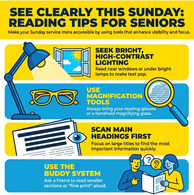
Seek prompt eye care for warning signs such as:
- Sudden blurring or a sudden decrease in vision
- New flashes, a shower of floaters, or a curtain-like shadow
- Eye pain, marked redness, severe headache, or nausea with visual symptoms
- New double vision, missing areas, bent lines, or distorted words
- A rapid change that affects one eye more than the other
New flashes, many new floaters, or a decrease in vision can accompany a retinal tear or detachment and should be assessed promptly.
Key takeaway: A clearer seat, cleaner glasses, or better magnification can improve ordinary reading difficulty. They should not be used to explain away a sudden or rapidly worsening change.
Why the Bulletin Blurs Before the Sermon Begins
Near vision often changes before distance vision feels difficult
A person may read the hymn board across the sanctuary, recognize faces, and drive comfortably, yet struggle with the prayer list six inches from the nose. Distance and near vision place different focusing demands on the eyes.
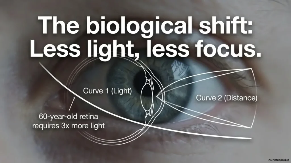
With age-related near-focus changes, the clearest reading point may move farther away. That is why bringing tiny print closer can make it worse rather than better. For a broader home practice routine, see these presbyopia reading tips for seniors.
Low contrast quietly removes the edges of letters
Letters are easier to identify when their edges are distinct. Thin gray type on cream paper may look elegant on a designer’s monitor, but under sanctuary lighting it can resemble a pencil note that has survived three erasers.
Glossy coating adds another obstacle. Light reflects from the page into the eyes, reducing the useful difference between text and background. The reader may describe the result as blur even when the real problem is glare plus weak contrast.
Fatigue, dryness, and reduced blinking change the page
Concentrated reading often reduces blinking. The tear film can become less stable, causing words to sharpen after a blink and blur again moments later. Poor sleep, dry indoor air, and some medications may add to the difficulty.
If print is clearer in the morning or briefly improves after blinking, dryness may be part of the picture. The guide to dry eyes from reading explains practical questions to track before discussing persistent symptoms with an eye-care professional.
Show me the nerdy details
Reading comfort depends on more than visual acuity. It also involves accommodation, contrast sensitivity, tear-film stability, lighting direction, letter spacing, viewing distance, and the number of words visible at one time.
Magnification makes individual letters larger, but it also reduces the amount of text visible through the lens or on the screen. Stronger magnification can therefore improve letter recognition while making line tracking slower.
This is why the best setup is usually a combination: adequate correction, controlled light, strong contrast, stable posture, and only as much magnification as the task requires.
The 20-Inch Test: Find Your Clearest Reading Position
Move the bulletin before blaming your eyes
Twenty inches is not a medical rule or a required distance. It is a useful starting point for a simple experiment. Many readers automatically hold difficult print closer, even when their clearer focusing range has shifted farther away.
- Sit with your back supported and your shoulders relaxed.
- Hold the bulletin at roughly arm’s length, then bring it closer slowly.
- Stop where the text first becomes comfortably clear.
- Move it an inch closer and an inch farther to compare.
- Notice whether you are tilting your head, squinting, or lifting your chin.
Use the distance that gives comfortable clarity without forcing your neck or arms into a strained position. A reading distance that works for one pair of glasses may not work for another.
Keep the page slightly below eye level
A bulletin held a little below eye level often allows a more natural head position. Looking slightly downward may also expose less of the eye’s surface than staring straight ahead with the eyes wide open.
A Bible, hymnal, purse, or slim lap desk can support the lower edge of the page. The point is not to build a Sunday furniture showroom. It is to stop the arms from holding the bulletin in midair for an hour.
Let’s be honest: posture matters more than it sounds
Neck tension and tired shoulders do not directly change an eyeglass prescription, but they can shorten reading endurance. Once discomfort builds, readers may rush, lose their place, or assume their eyesight has deteriorated during the service.
Try supporting both elbows, keeping the chin level, and resting the page against something stable. This modest adjustment often improves the whole experience because the eyes no longer have to track moving text held by tired hands.
The Sunday Clarity Sequence
Choose even light.
Find the clear zone.
Tilt away glare.
Clean and inspect.
Rest hands and elbows.
Track one line.
Use only what helps.
Request large print.
Act on warning signs.
Better Lighting Without the Glare Trap
Light the page, not the eyes
More light is helpful only when it reaches the bulletin without shining directly into the reader’s eyes. An evenly lit aisle seat may work better than a bright window seat where sunlight strikes the page and rebounds like a tiny searchlight.
Before the service, compare two nearby seats if that is practical. Hold the bulletin in your normal reading position and look for shadows, bright reflections, and areas where the ink seems to fade.
Tilt glossy pages instead of squinting harder
When a bright patch covers the words, change the angle between the paper and the light. A small tilt may remove the reflection immediately. Moving the page is usually quicker and kinder than narrowing the eyes and hoping the ink surrenders.
If glare moves across the page as the bulletin moves, the coating or lighting is likely contributing. If the same letters remain distorted regardless of angle, an eye examination may be more useful than further glare experiments.
Use a small reading light respectfully
A compact light can help in a dim sanctuary, but the beam should be warm, narrow, and directed downward. Test it at home in a dark room. Sit beside someone and check whether the light spills into their face or reflects from nearby glossy pages.
- Choose a light with adjustable brightness.
- Prefer a shaded or focused beam over an exposed bright bulb.
- Clip it securely so it does not swing during standing portions of worship.
- Turn it off when it is no longer needed.
- Ask an usher about suitable seating when lighting varies sharply.
Key takeaway: The best light is not necessarily the brightest light. Look for even illumination, low reflection, and a beam that reaches the page without entering the eyes.
Reading Glasses and Magnifiers: Compare Before You Buy
Three reading-glasses mistakes that create new problems
Reading glasses can be wonderfully ordinary tools. The trouble begins when a borrowed pair, an unsuitable strength, or damaged lenses force the reader into an awkward distance.
- Borrowing another person’s readers: The strength may not suit your eyes or preferred distance.
- Choosing the strongest pair: Stronger is not automatically clearer and may reduce the comfortable working distance.
- Keeping scratched lenses: Scratches, fingerprints, and cloudy coatings reduce contrast, especially in dim light.
If your current pair makes you lean too close, feel dizzy, develop headaches, or close one eye to read, review these signs that reading glasses may be too strong. Persistent difficulty deserves professional assessment rather than a drawer full of increasingly powerful guesses.
Match the magnifier to the task
A pocket magnifier is often enough for a hymn number, a date, or a phone extension. It may be frustrating for an entire page because the visible area is small and the hand must move steadily from word to word.
A flat page magnifier covers more text and requires less precise positioning. A stand magnifier can help readers with tremor, arthritis, reduced grip, or fatigue because the lens rests at a fixed distance from the page.
Electronic magnifiers add adjustable enlargement and contrast choices. Their advantage is control. Their disadvantages may include charging, setup, screen glare, a narrower visible field at high magnification, and the possibility of becoming another object that needs its own Sunday morning search party.
Good, better, best: a practical reading-tool comparison
| Setup | What it includes | Best for | Cost level | Main limitation |
|---|---|---|---|---|
| Good | Clean reading glasses, bookmark, chosen seat | Occasional small-print difficulty | Low or no added cost | Does not enlarge unusually small text |
| Better | Proper readers, line guide, pocket or page magnifier | Frequent bulletin and hymnal use | Low to moderate | Requires carrying and positioning tools |
| Best control | Updated prescription, accessible bulletin, digital zoom or electronic magnifier | Persistent difficulty or diagnosed low vision | Moderate to higher | May require setup, training, or professional guidance |
Before paying for a premium device, test the task you actually need to perform. Bring a bulletin or print a similar page. Check whether the tool shows an entire service-order line, whether buttons are easy to find, and whether you can use it without holding your breath like a safecracker.
When a free fix is enough, and when paid help may be worth it
A free adjustment may be enough when the problem improves with a clearer seat, clean lenses, a different page angle, or a digital copy enlarged on a phone. A low-cost magnifier may be sufficient when only hymn numbers and brief announcements are difficult.
Professional help becomes more valuable when reading remains difficult across settings, one eye differs noticeably from the other, ordinary readers cause discomfort, or an eye condition limits vision even with regular glasses. A low-vision evaluation may include task-specific tools and training rather than simply prescribing more magnification.
For a deeper comparison, see reading glasses versus magnifiers. Readers preparing for an appointment can also use these questions to ask an eye doctor about reading glasses.
Key takeaway: Buy for the task, not the impressive magnification number. The best tool is the one you can position, carry, and use comfortably for the amount of text you need to read.
The Finger-Guide Method That Prevents Lost Lines
Use a finger, bookmark, or reading strip
Looking from the bulletin to the pulpit and back again is a repeated navigation task. The eyes must relocate the exact line, column, or response. Dense layouts make that return journey harder.
Place a finger, dark bookmark, index card, or reading strip directly beneath the current line. When you look up, leave the guide in place. When you look down, the next words are waiting above it.
Cover nearby text to reduce visual crowding
Sometimes the difficulty is not seeing an individual word. It is separating that word from everything printed around it. A plain card can cover the lower half of a crowded announcement box, leaving only one or two lines visible.
Choose a matte card in a color that contrasts with the bulletin. Black, dark blue, or deep green often creates a clear edge against white paper. Avoid reflective laminated strips that may introduce a second glare problem.
Short Story: The bookmark that returned the service
Mrs. Alvarez could read the bulletin at home, but Sunday was different. Each time she looked toward the pulpit, she lost her place. By the third hymn, she had stopped following the printed responses and simply listened.
Her daughter assumed the print was too small and bought a stronger magnifier. It enlarged the words beautifully, but showed so little of the page that finding the next line became harder.
An usher offered a dark paper bookmark. Mrs. Alvarez placed it beneath each line and left it there whenever she looked up. The tool cost almost nothing, required no batteries, and did not announce itself to the room.
The lesson was quiet but useful: the problem was not only letter size. It was returning to the correct place. Sometimes accessibility begins with understanding the task more precisely.
Church Bulletin Reading Mistakes That Increase Eye Strain
Holding the page too close for too long
When words look small, the natural response is to bring them closer. With presbyopia, that reaction may move the page outside the clearest focusing range. The reader then squints, bends the neck, and blames the glasses.
Move the page through several distances before deciding it is unreadable. If clarity appears farther away but the letters become too small, appropriate magnification may help more than bringing the paper closer.
Squinting instead of changing the environment
Squinting may briefly sharpen edges, but it is not a comfortable long-service strategy. Change one variable at a time: distance, seat, light direction, page angle, lens cleanliness, or magnification.
This method also reveals the likely source of the difficulty. If tilting the page solves it, glare was important. If blinking solves it briefly, dryness may contribute. If no adjustment helps, an examination becomes the sensible next step.
Trying to read every announcement during the service
Financial summaries, volunteer schedules, event addresses, and registration instructions are not ideal reading during a thirty-second transition. Review dense material before worship, after the service, or at home through a digital copy.
Before the opening hymn, circle the service order, hymn numbers, scripture references, and responsive readings. This turns a crowded bulletin into a simple route map.
A safer alternative for each common mistake
| Common mistake | Why it backfires | Try this instead |
|---|---|---|
| Pulling the bulletin very close | May move print outside the clearest near-focus range | Test several distances slowly |
| Using the strongest readers available | Can create an impractical working distance | Compare strengths with real bulletin-sized print |
| Reading through glare | Reduces useful contrast | Tilt the page or change seats |
| Holding the bulletin in midair | Creates hand, shoulder, and neck fatigue | Support elbows and rest the page |
| Reading every dense notice immediately | Encourages rushing and lost lines | Mark service essentials and review details later |
| Ignoring repeated blur | May delay an updated prescription or needed evaluation | Document the pattern and arrange an eye examination |
What Better Lighting Cannot Fix
Ordinary aging does not automatically mean low vision. Low vision is more common among older adults partly because conditions that can cause it, including macular degeneration, cataracts, diabetic retinopathy, and glaucoma, are more common with age.
Cataracts may scatter light instead of using it
Cataracts can cause blurry vision, faded color, light sensitivity, glare, and difficulty in low light. In that situation, adding a brighter lamp may increase discomfort without restoring crisp print.
Notice whether glossy paper, bright windows, headlights, or overhead fixtures create halos or washed-out areas. Bring those observations to an eye appointment rather than simply buying a more powerful bulb.
Macular changes can distort central words
Central vision is important for reading fine detail. Warning signs may include missing letters, a blurry central patch, reduced color brightness, or straight lines appearing wavy or crooked. The National Eye Institute advises prompt eye care when straight lines begin looking wavy.
A reader may discover that looking slightly beside a word makes it easier to see. That can be a useful observation to report, but self-training should not replace an examination or guidance from a low-vision professional.
Glaucoma may affect navigation before small print
Glaucoma often has no early symptoms, but over time it can cause loss of peripheral vision.
Reduced side vision may make it harder to locate columns, find the start of a line, notice a person entering the aisle, or move safely through a crowded sanctuary. A larger font alone may not solve these navigation problems.
Diabetes, health changes, and medicines can affect focus
Vision that fluctuates from day to day deserves attention, especially when it occurs alongside changes in blood sugar, medication, hydration, or general health. Do not adjust prescribed medicine solely because reading seems different.
Record when the blur occurs, whether blinking helps, whether one eye is worse, and whether distance vision changes too. That small log gives a clinician more useful information than “the bulletin was fuzzy again.”
Key takeaway: A practical reading trick should produce a practical improvement. When glare, distortion, missing areas, unequal vision, or persistent blur remains, document the pattern and ask for professional evaluation.
How Churches Can Design Bulletins Aging Eyes Can Read
Enlarge the instructions before enlarging the headline
A giant decorative title does little for a reader who cannot see the responsive-reading cue, room number, registration deadline, or phone extension. Prioritize the text people must act on.
Point size matters, but it does not work alone. Typeface, weight, letter spacing, line spacing, column width, print quality, and viewing distance all shape readability. Churches refining templates can use this guide to the best font size for seniors as a starting point, then test with real readers.
Choose strong contrast and familiar letter shapes
Dark text on a plain light background is usually the safest print choice. Avoid pale gray body copy, ultra-thin type, condensed fonts, and long passages in italics or capital letters.
For digital bulletins, WCAG guidance uses a minimum contrast ratio of 4.5:1 for most normal-sized text. Print is not measured in precisely the same way under changing physical light, but the principle remains useful: clear separation between letters and background supports readability.
Give every section room to breathe
Visual crowding makes a page feel smaller than it is. Use visible headings, short paragraphs, generous spacing, simple lists, and predictable alignment. Keep related information together so the reader does not have to hop between columns.
- Keep the service order in one clear sequence.
- Place hymn numbers where readers expect to find them.
- Use bold selectively for labels and actions.
- Avoid placing essential text in narrow sidebars.
- Keep phone numbers, dates, and room names on one line when possible.
- Use matte or low-sheen paper when available.
Offer large-print and digital alternatives discreetly
Place large-print copies beside standard bulletins rather than hiding them behind a desk. Ushers can mention them naturally: “We have standard and large-print copies here.” That sentence preserves dignity because it offers a choice instead of requiring a public explanation.
A digital bulletin should contain selectable text, not only a photograph of the printed page. Readers can then enlarge text, use screen magnification, adjust brightness, or use text-to-speech tools.
| Bulletin feature | Harder to read | More accessible alternative |
|---|---|---|
| Body text | Small, thin, condensed type | Larger, medium-weight familiar type |
| Background | Photographs, textures, stained-glass patterns | Plain light background |
| Paper | High-gloss reflective coating | Matte or low-sheen stock |
| Layout | Several narrow columns | One or two clear reading paths |
| Emphasis | Long passages in italics or capitals | Short bold labels and clear headings |
| Alternative format | Available only by special request | Large-print and digital copies offered routinely |
Key takeaway: Accessibility is not achieved by making one headline enormous. Improve the information people must read, use, follow, and remember.
Paper, Phone, or Tablet: Choose the Format That Gives Control
Paper works when contrast and spacing are strong
Paper is familiar, quick, quiet, and free from battery worries. It works with bookmarks, reading strips, page magnifiers, and handwritten circles. It also keeps the whole service order visible at once.
Its weakness is fixed formatting. The reader cannot enlarge one paragraph, reverse colors, or increase spacing. A poorly designed printed page remains stubbornly itself.
Phones help when pinch-to-zoom is available
A phone can enlarge one section quickly and may already include magnification, text-to-speech, brightness controls, and contrast settings. It is especially useful for announcements that can be reviewed after the service.
Zooming too far can force constant horizontal scrolling. Increase text only enough to read comfortably, hold the screen at a stable distance, and lower excessive brightness in a dark room.
Silence calls, alarms, message previews, and app sounds before worship. Accessibility technology should support the service, not volunteer for an unexpected solo.
Tablets preserve more context on a larger screen
A tablet may show enlarged type while keeping several lines or an entire section visible. This can make it easier to follow responsive readings, longer prayers, or a complete service guide.
| Format | Main strength | Main weakness | Best fit |
|---|---|---|---|
| Standard paper | Simple and familiar | Fixed text size | Readers helped by good print design |
| Large-print paper | Clearer type without technology | More pages and bulk | Readers who prefer paper |
| Phone | Portable zoom and accessibility settings | Small screen and narrow context | Short sections and announcements |
| Tablet | Larger adjustable display | More equipment to carry | Complete service guides |
| Electronic magnifier | Flexible size and contrast | Higher cost and setup | Frequent reading with low vision |
Readers who also struggle with scripture text may wish to compare giant-print Bible options with a tablet-based Bible app. The better choice is the one that preserves comfortable line length, manageable page weight, and reliable access.
Vision rehabilitation can help people with visual impairment use tools, training, and practical strategies to manage daily activities and maintain independence.
Frequently Asked Questions
What font size is easiest for older adults to read?
There is no single point size that works for every reader. A larger font generally helps, but typeface, stroke weight, line spacing, contrast, print quality, and viewing distance are equally important.
Churches should test body text, service instructions, dates, and contact details with older readers in the actual sanctuary. A printout viewed under office lighting may perform very differently on Sunday morning.
Are drugstore reading glasses safe for church bulletins?
Over-the-counter readers may help people who need similar magnification in both eyes and have no unresolved symptoms. They do not correct every refractive issue, and they may not suit people with unequal prescriptions, significant astigmatism, double vision, persistent headaches, or continuing blur.
Compare strengths using realistic reading material and a comfortable working distance. Do not treat the strongest available pair as an upgrade.
Why can I read the hymn board but not the bulletin?
The hymn board is a distance task with large, high-contrast characters. The bulletin is a near task involving smaller letters, denser information, and different focusing demands. Clear distance vision does not guarantee clear near vision.
Is a magnifying glass better than stronger reading glasses?
They serve different purposes. Reading glasses provide optical correction across the reading area at a set distance. A magnifier enlarges the appearance of selected text and can be useful for unusually small details.
Stronger readers may create an inconveniently close working distance. Stronger magnification may show fewer words at once. The best choice depends on the task, the eyes, hand control, posture, and how long the material must be read.
Why does print sometimes look clearer in the morning?
Fatigue, reduced blinking, dry air, prolonged close work, lighting, and medication timing may change reading comfort during the day. Morning clarity does not establish a diagnosis.
Track when the change occurs and whether blinking, rest, lighting, or distance improves it. Share a persistent pattern with an eye-care professional.
Can cataracts make glossy church bulletins harder to read?
Yes, cataracts can be associated with glare, light sensitivity, faded color, and blurry vision. Glossy paper may reflect sanctuary lights and reduce useful contrast, making the reading task less comfortable.
Should churches provide large-print bulletins?
Large-print copies can support participation, privacy, and independence. They are most helpful when offered routinely rather than treated as unusual equipment that must be requested in front of other people.
A church can begin with a small number of copies, ask users for feedback, and revise the template based on actual readability rather than assumptions.
When should bulletin-reading difficulty be checked by an eye doctor?
Arrange an examination when difficulty persists despite clean appropriate glasses, reasonable lighting, and a comfortable reading distance. Seek prompt care for sudden blur, new flashes or floaters, a curtain-like shadow, pain, double vision, missing areas, or newly distorted lines.
Prepare a Sunday Reading Kit in 15 Minutes
Build the kit you will actually remember
Gather the items in one place rather than depending on Sunday-morning memory. A small zip pouch, Bible cover pocket, purse compartment, or mobility-bag pocket works well.
- A clean, suitable pair of reading glasses
- A soft lens cloth
- A dark matte bookmark or index card
- A pocket magnifier for brief details
- A compact reading light if the sanctuary is consistently dim
- A note containing your preferred digital bulletin link or access method
Keep the kit with the bag, coat, keys, or Bible that already goes to church. The best storage place is not the tidiest drawer. It is the location that reliably joins you on Sunday.
Test the setup with a real bulletin-sized page
- Open a recent church bulletin or print a page with similar text.
- Sit in a chair with lighting similar to the sanctuary.
- Find the clearest reading distance without hunching.
- Tilt the page to check for reflections.
- Read three lines using the bookmark as a guide.
- Try the magnifier only on the smallest details.
- Mark anything that remains distorted, missing, or persistently blurred.
This small rehearsal closes the loop. By Sunday morning, you will know where to sit, how far to hold the page, which tool helps, and which problems need a conversation with an usher, bulletin designer, or eye-care professional.
The bulletin does not need to become perfect before it becomes kinder. One clearer page, one discreet large-print option, or one dark bookmark can return a surprising amount of ease to worship.
Your next 15-minute step
Clean your reading glasses, place them beside a matte bookmark and pocket magnifier, then test the kit with one real bulletin page. Adjust the distance, light, and page angle until the words feel steady rather than negotiated.
Last reviewed: 2026-08