

Organize your questions and next steps, then save your worksheet.
Summary and next steps
Ask the pharmacy for a more accessible label rather than rewriting medication instructions yourself.
- Name the label detail that is unreadable.
- Ask about large print, audible or another accessible format.
- Have the pharmacist verify the current instructions at pickup.
Editorial maintenance: October 24, 2026. Summary layout, related links and technical metadata updated. This is not a full clinical review.
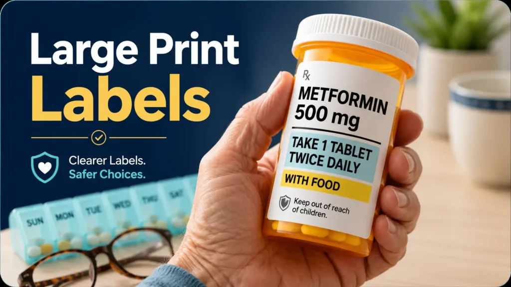
Medication clarity for aging eyes
Large Print Medication Label Tips
for Older Adults
A pill bottle may be small, but the decisions printed on it are not. Drug names, strengths, dosing times, warnings, and expiration information can blur into a pale ribbon of text when near vision changes, lighting is poor, or several medications look almost identical.
The safest solution is not simply to make a homemade label bigger. It is to ask the pharmacy for an accessible, accurate format that preserves the original instructions while making the most important information easier to find. Large print, strong contrast, clear spacing, readable timing, and a pharmacist read-back work together as one system.
This guide shows older adults and caregivers how to request better labels, test bottles under real conditions, compare low-cost and higher-support options, avoid well-meant labeling mistakes, and recognize the moment when print is no longer enough.
The goal is not giant text everywhere. It is the right information, made unmistakably clear. 🔎
Snapshot
This article is for older adults with changing near vision, family caregivers, and adult children helping manage prescription or over-the-counter medicines. You will learn what an accessible medication label should include, what to ask the pharmacy, how to test readability at home, and when to move beyond print to audible, electronic, tactile, or caregiver-supported systems.
Table of Contents
Before You Change Any Medication Label
What this guide can and cannot do
This guide offers general medication-safety information. It cannot confirm that a particular dose, schedule, tablet, capsule, storage method, pill organizer, or labeling system is appropriate for an individual patient.
The pharmacy label, current prescriber instructions, and direct guidance from a pharmacist remain the authoritative sources. Never change a dose, split or crush a medicine, transfer medication into a different container, or rewrite instructions without professional confirmation.
Before you act
Do not cover, remove, alter, or replace the official pharmacy label. Ask the pharmacist for an accurate duplicate in a more accessible format. If a label conflicts with what the prescriber said, pause and call the pharmacy before taking the next dose.
Who may need more than large print
Large print can work well for an older adult who reads reliably when text is larger, darker, and better spaced. It may not be enough for someone with advanced vision loss, fluctuating vision, severe glare sensitivity, cognitive impairment, or difficulty distinguishing similar names.
- The person still guesses after using reading glasses or a magnifier.
- Medication bottles are identified mainly by shape, cap color, or location.
- The reader cannot reliably compare the accessible label with the official label.
- Instructions are forgotten moments after being read.
- Several medicines have similar names, strengths, or tablet appearances.
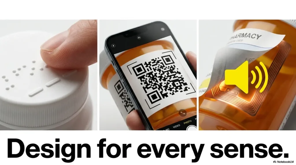
In those situations, ask about audible prescription labels, electronic text, braille, tactile markers, caregiver verification, or a professionally reviewed medication-management plan. The safest format is the one the patient can use correctly on an ordinary Tuesday evening, not only during a careful demonstration at the pharmacy counter.
Key takeaway
Independence is safest when it reduces guessing. Needing audible, electronic, tactile, or caregiver support is not a failure of independence. It is a better-designed form of it.
What an Accessible Large-Print Medication Label Needs
The 18-point detail many families miss
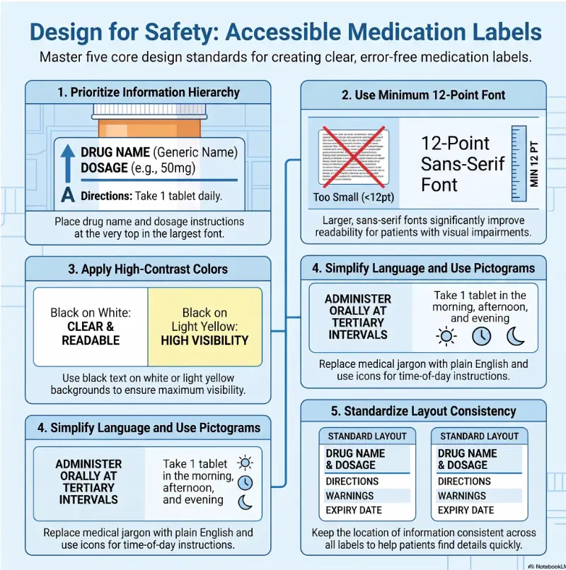
U.S. accessibility best practices recommend 18-point bold type for a hard-copy large-print prescription label. They also favor a non-condensed sans-serif font, horizontal text, generous spacing, and strong contrast.
This is advisory guidance rather than a universal label format that every pharmacy must use. Still, it gives families a concrete starting point. “Can you make it bigger?” is vague. “Do you offer an 18-point bold, high-contrast accessible label?” is a request the pharmacy can evaluate.
Contrast, spacing, and material matter
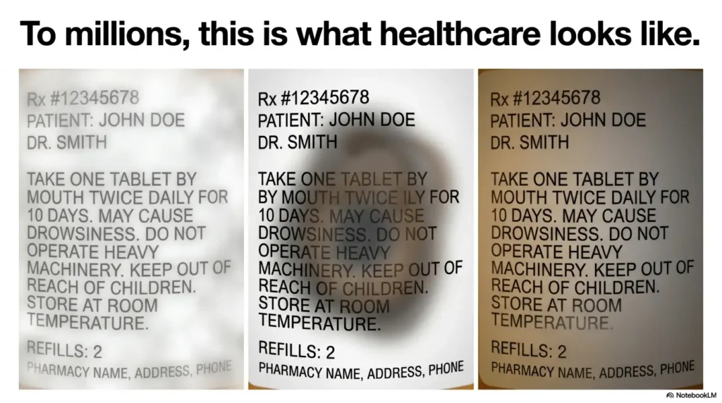
Font size is only one piece of readability. Pale gray text printed on glossy tape can remain difficult even when enlarged. Crowded lines also make it easier to skip from one instruction to another.
- Contrast: Dark text on white or pale yellow is usually easier to read than decorative color combinations.
- Finish: Matte material is generally more usable than a shiny surface that catches overhead light.
- Font: A simple, non-condensed sans-serif typeface keeps letter shapes open and distinct.
- Spacing: Extra line spacing helps prevent the eye from sliding into the wrong line.
- Direction: Horizontal text is easier to track than text printed vertically around the bottle.
- Case: Sentence case is usually easier to scan than long instructions in all capitals.
Information hierarchy beats giant text
Making every word equally large can turn a label into a paper scarf wrapped around a tiny bottle. The reader rotates the container, loses the beginning of the instruction, and then starts again.
A patient-centered label should make the safety-critical information easiest to locate:
- Patient name
- Medication name
- Medication strength
- Amount to take or use
- Timing and conditions
- Purpose, when appropriate
- Critical warnings
Prescription numbers, refill data, pharmacy addresses, and administrative details still matter, but they should not visually shout over the dose.
Clear timing language prevents quiet errors
Instructions such as “twice daily” can be interpreted in several ways. One person may take the doses at breakfast and lunch. Another may take both during waking hours only a few hours apart.
When it accurately matches the prescription, clearer wording may separate the amount from the time, such as “take one tablet in the morning and one tablet in the evening.” The patient should not make that translation alone. Ask the pharmacist to confirm the intended schedule.
| Label element | Harder to use | More accessible approach |
|---|---|---|
| Drug name | Small, condensed, or surrounded by administrative text | Bold, prominent, and separated from other information |
| Strength | Tiny numbers placed far from the drug name | Clearly paired with the medication name |
| Directions | Long sentence wrapped around the bottle | Short lines with the amount and timing easy to locate |
| Warnings | Faint auxiliary stickers on glossy material | High contrast with verbal pharmacist confirmation |
| Purpose | Missing when several medicines are similar | Plain-language purpose when suitable and requested |
Show me the nerdy details
Readable type depends on more than point size. Condensed letterforms reduce the white space inside and between characters. Gloss produces reflected light that can lower practical contrast. Long line lengths increase the chance of losing one’s place, particularly when the label curves around a cylinder.
A strong accessible label therefore combines size, weight, spacing, contrast, line length, material, orientation, and information order. It is closer to a small safety interface than a simple piece of enlarged paper.
Ask the Pharmacy Before Pickup, Not After
Use a specific pharmacy request
Accessible labels may require extra preparation, a different container, a duplicate printed sheet, an electronic system, or a service that is not available at every location. Calling before the prescription is filled gives the pharmacy time to explain the options.
A simple call script
“I have difficulty reading standard prescription labels. Do you offer a bold, high-contrast large-print label, preferably around 18-point type? I also need the medication name, strength, dose, timing, purpose, and main warnings to be easy to locate. If print is not enough, what audible or electronic options do you provide?”
For a shorter version to keep beside the phone, use this low-vision pharmacy help script.
Compare accessible label options before paying
Some solutions may be available through the pharmacy at little or no extra cost. Others require a device, smartphone, subscription, compatible app, or caregiver setup. Ask about the full process before buying anything.
| Setup level | What it may include | Best fit | What to verify |
|---|---|---|---|
| Good | Pharmacist-produced large-print duplicate, larger container, improved lighting | Readers who can use print reliably when it is larger and clearer | Accuracy, contrast, font size, replacement process after dose changes |
| Better | Large print plus a magnifier, large-print schedule, and refill verification routine | People managing several medications or variable lighting | Magnifier field of view, glare, schedule updates, caregiver access |
| Best support | Audible or electronic labels, tactile cues, pharmacist review, caregiver backup | Advanced vision loss, repeated confusion, or similar-looking containers | Device compatibility, training, privacy, ongoing cost, support after pharmacy changes |
A handheld or stand magnifier may help with occasional reading, but the best choice depends on hand steadiness, field of view, lighting, and whether the user must hold both the bottle and the magnifier. Compare those factors in this guide to magnifiers for seniors.
Complete a pharmacist read-back
Before leaving, ask the pharmacist to state the important information aloud while the patient follows it on the accessible label. This connects the spoken instruction to the printed location.
- What is the name of this medicine?
- What is the strength?
- How much should be taken or used?
- At what time, interval, or condition?
- What is it for?
- What important warning should be remembered?
- Has anything changed since the previous refill?
Caregivers should also compare the new bottle with the current medication list. A one-page medication list template can make that check faster, especially when several clinicians are involved.
Key takeaway
Request the format before pickup, verify it at the counter, and ask for a read-back. A readable label is useful only when it matches the current prescription exactly.
The Five-Second Bottle Test
Can the medicine be identified without guessing?
Place the bottle at the person’s normal reading distance. Do not coach them, point to the correct line, or allow them to identify it by where it usually sits.
Within about five seconds, can the reader locate the drug name, strength, dose, timing, purpose, and main warning? The exercise is not a speed contest. It reveals whether the label’s information hierarchy works before the patient is tired, distracted, or in a hurry.
The CLEAR bottle check
Test it where medicine is actually taken
A label that looks clear beneath pharmacy lighting may fail beside a dim kitchen counter or bedroom lamp. Test the bottle in the room where the medication is normally used.
- Use the patient’s normal glasses or visual aid.
- Check morning, afternoon, and evening lighting.
- Test on a tired-eye day, not only a good-vision day.
- Confirm that the bottle can be held at a comfortable distance.
- Check whether the label remains readable without dangerous bending or leaning.
- Look for reflections from glossy tape or polished countertops.
Glare is a quiet saboteur
More light does not always mean better light. A bare bulb aimed directly at a shiny label may wash out the letters. Diffused task lighting positioned from the side often improves readability more than another small increase in font size.
Move the lamp, tilt the bottle slightly, and place a plain matte surface beneath it. The improvement can be surprisingly immediate, rather like wiping steam from a bathroom mirror.
Short Story: The bottle that worked at noon
Marian could read her new large-print label at the pharmacy. At home, she placed the bottle beside the kettle and felt relieved. The drug name was clear, and the dose looked comfortably large.
That evening, the glossy label caught the light above the stove. One line disappeared beneath a white reflection. She rotated the bottle, found the instruction again, then lost the strength printed near the edge.
Her daughter did not order a stronger magnifier immediately. First, they moved the medication station to a matte tray beneath a shaded task lamp. Then they asked the pharmacy for a non-glossy duplicate label and a larger container.
The lesson was small but durable: readability is not a property of the label alone. It is the result of the label, the light, the room, the reader, and the routine working together.
Common Label Mistakes That Create New Risks
Do not cover or rewrite the official label
Homemade labels often begin with good intentions. A caregiver writes “morning pill” in thick marker, tapes it over the bottle, and believes the problem is solved.
The new sticker may hide the medication name, strength, expiration information, refill number, storage instructions, or warnings. It may also remain on the bottle after the prescription changes.
A supplemental card can be useful when it is checked against the current pharmacy label and updated promptly. It should never replace or obscure the official information.
Do not transfer pills casually
Moving medication into an unlabeled jar removes information needed by the patient, caregiver, pharmacist, emergency clinician, or Poison Control specialist. Even a familiar white tablet can become impossible to identify once separated from its container.
Pill organizers can help some people, but they also separate doses from original labels. Ask a pharmacist or clinician whether an organizer is appropriate, especially after a recent dose change, hospital discharge, or new prescription.
Do not trust pill color, shape, or cap color
A pharmacy may dispense the same medicine from a different manufacturer. The tablet can change color, markings, or shape while the active medication remains equivalent.
Unexpected appearance changes should still be checked before the medicine is taken. For a practical refill-check routine, see this guide to similar-looking pills.
| Common mistake | Why it fails | Safer alternative |
|---|---|---|
| Writing “AM” over the pharmacy label | May hide the drug name, strength, or warning | Use a removable secondary cue away from official text |
| Copying the dose from memory | May remain after a prescription change | Ask the pharmacy for an updated accessible duplicate |
| Identifying bottles by location | Bottles can be moved or returned to the wrong spot | Read and verify the label every time |
| Identifying pills by color | Appearance can change between manufacturers | Confirm unexpected changes with the pharmacist |
| Enlarging only the drug name | Strength, timing, and warnings may remain unreadable | Enlarge all safety-critical information |
Key takeaway
A homemade system should add a secondary cue without hiding, replacing, or contradicting the official pharmacy label.
Color Coding and Assistive Tools: Helpful Until They Become Another Puzzle
Use color as a backup cue
A small removable marker may help distinguish morning medicine from bedtime medicine. Color should support readable words, not replace them.
A “rainbow pharmacy” creates a new decoding task. Similar shades, faded stickers, color-vision differences, and low evening light can turn a clever system into a cabinet full of riddles.
- Use as few colors as possible.
- Pair every color with a large printed word.
- Place the cue where it does not cover official information.
- Document the system for caregivers.
- Review it after every medication change.
Add a second sensory cue carefully
Tactile markers may help distinguish containers, but they should not communicate a dose by themselves. A dot that means “evening” can be misread if the bottle is reused, rotated, or handed to another person.
Any tactile system should be simple, documented, consistently placed, and checked by the pharmacy or care team when it affects medication selection.
Free and low-cost tools that may be enough
- A pharmacist-produced large-print duplicate
- A large-print medication schedule
- Bright, diffused task lighting
- A phone camera used to enlarge the complete label
- A stand magnifier that leaves both hands available
- A current medication list stored in a wallet and phone
- A caregiver refill-check routine
A schedule can reduce repeated bottle handling, but it must be kept current. This large-print medication schedule explains how to organize names, strengths, timing, and purposes without replacing the pharmacy label.
When paid tools or services may be worth considering
A paid device or service may be reasonable when the patient cannot use print reliably, lives alone, manages many medications, or has had repeated close calls. The purchase should solve a defined problem rather than add another gadget to charge, pair, update, and misplace.
- Does it read the complete current pharmacy information?
- Does it work without complicated navigation?
- Can the patient operate it independently?
- What happens when the pharmacy changes the label or container?
- Is there an ongoing fee?
- Can a caregiver access the information without compromising privacy?
- Is training and customer support available?
- What is the backup plan during a power, battery, phone, or internet problem?
Eye drops deserve special attention because several small bottles may feel alike. Caregivers managing ophthalmic medicines may also find these eye-drop labeling tips for seniors useful.
OTC Labels Need a Different Reading Plan
Start with the active ingredient, not the brand name
Over-the-counter products can have similar brand names while containing different active ingredients. Two packages from the same product family may be designed for different symptoms, strengths, age groups, or times of day.
Read the Drug Facts label each time. Ingredients, directions, and warnings can differ between versions and may change over time.
Scan the Drug Facts sections in order
- Active ingredient: The medicine actually producing the drug effect.
- Purpose: What category of medicine it is.
- Uses: The symptoms or conditions it is intended to address.
- Warnings: Reasons to avoid it, stop it, or ask a professional first.
- Directions: Amount, frequency, age restrictions, and maximum use.
- Other information: Storage or handling instructions.
- Inactive ingredients: Non-drug ingredients that may matter for allergies or sensitivities.
Do not assume that a familiar front label means the back label is unchanged. The front is marketing. The Drug Facts panel is where the medication decisions live.
Magnify without losing context
A phone camera can enlarge one line beautifully while hiding the warning directly above it. Zooming too far also makes it difficult to tell whether a number belongs to the adult dose, a child dose, or a maximum daily limit.
First capture the whole Drug Facts panel. Then enlarge one section at a time while keeping the section heading visible. When an ingredient, interaction, age restriction, or dose remains unclear, ask a pharmacist rather than stitching together partial lines.
Key takeaway
For OTC medicine, identify the active ingredient before comparing brands. Similar packaging does not mean similar medication.
When to Get Help Instead of Reading Again
Call the pharmacist promptly when something does not match
- The medication name or strength differs from what was expected.
- The label conflicts with the prescriber’s spoken or written instructions.
- The directions say “take as directed,” but no clear directions were provided.
- The pill or container looks different from the previous refill.
- A warning, abbreviation, or dosing interval is unclear.
- The label is damaged, smeared, detached, folded, or unreadable.
- A dose may have been taken twice, skipped, or confused with another medicine.
- The patient cannot explain the instructions without guessing.
Keep the bottle nearby when calling. The pharmacist may need the drug name, strength, prescription number, time of the last dose, and a description of what happened.
Possible medication errors and Poison Control
In the United States, contact Poison Control at 1-800-222-1222 for immediate guidance after a suspected overdose, double dose, wrong medication, or accidental ingestion. Do not wait for symptoms to appear before seeking guidance.
When symptoms are an emergency
Call 911 for life-threatening symptoms, including trouble breathing, swelling of the face or throat, blue lips, fainting, seizure, inability to awaken, severe confusion, chest pain, or rapidly worsening symptoms after taking medication.
Do not drive a severely ill person to search for a pharmacy receipt or medication list. Bring the available containers and records, but emergency care comes first.
Large-Print Medication Label FAQ
Can I ask any pharmacy for a large-print prescription label?
Yes, you can ask. Available formats and preparation methods vary by pharmacy and location. Contact the pharmacy before pickup so staff can explain whether they provide large-print duplicates, larger containers, audible labels, electronic access, braille, or another accessible option.
What font size is best for a medication label?
Accessible prescription-label guidance recommends 18-point bold type for hard-copy large print. The most usable format also depends on contrast, font style, spacing, glare, line length, and the individual reader’s vision.
Should I make my own enlarged medication label?
Do not replace, remove, alter, or cover the official pharmacy label. Ask the pharmacist for an accurate accessible duplicate. A caregiver-created schedule or reminder card may be useful as a supplement when it is verified and kept current.
Are talking prescription labels available?
Some pharmacies provide audible or electronic prescription-label systems. Availability may differ for local pickup and mail-order prescriptions. Ask how the system works, what device is required, whether there is a fee, and how replacement labels are handled.
Can the pharmacist print the reason for taking the medicine?
A plain-language purpose can help distinguish medications when it is suitable and the patient wants it included. Privacy, prescribing details, and pharmacy practices may affect whether the purpose appears. Ask the pharmacist and prescriber what is appropriate.
Is a pill organizer safer than labeled bottles?
It can help some people follow a schedule, but it separates doses from their original labels. A pharmacist or clinician should help determine whether it is appropriate, especially when medications change often or some pills must remain in their original packaging.
What lighting makes labels easier to read?
Use bright, even, diffused task lighting positioned to illuminate the bottle without reflecting directly into the eyes. Matte surfaces and side lighting often reduce glare more effectively than a harsh overhead bulb.
What should caregivers check after every refill?
Verify the patient name, medication name, strength, appearance, dose, timing, purpose, warnings, refill date, and any change from the previous prescription. Update the medication list and remove outdated schedules from the medication station.
Optional video: Open the video on YouTube (external site).
Make One Pharmacy Call Today
The 15-minute label reset
Choose the one medication bottle that is currently hardest to read. Do not attempt to redesign the entire medication cabinet in one afternoon.
- Place the bottle under the lighting normally used and complete the five-second test.
- Write down which details are difficult to find: name, strength, dose, time, purpose, or warning.
- Call the pharmacy and request an 18-point bold, high-contrast accessible label or ask about audible and electronic alternatives.
- Ask whether a larger container or non-glossy duplicate is available.
- At pickup, compare the accessible version with the official label and complete a pharmacist read-back.
One clear bottle is a real beginning
Medication safety rarely improves through one grand organizational project. It improves through small corrections that remove one opportunity to guess: a clearer label, a better lamp, an updated schedule, a confirmed refill, a pharmacist’s voice attached to the words on the bottle.
Begin with the hardest label. Make it accurate, readable, and usable under real conditions. Then move to the next bottle. Clarity, built one label at a time, is how a crowded medicine shelf becomes a safer daily routine.
Your next step
Call the pharmacy with the hardest-to-read bottle beside you. Name the exact problem, request an accessible format, and ask how the instructions will be verified at pickup.
Last reviewed: 2026-08
PUT THIS GUIDE TO WORK · INTERACTIVE WORKSHEET
Accessible medication-label request checklist
Use this worksheet alongside the article: Large Print Medication Label Tips for Older Adults. Use the fields provided to organize your notes and next actions, then save your worksheet.
Your entries stay in this page and are cleared when you reload. No account is needed. Saved files are downloaded only to your device.
How to use your result
Save the worksheet before leaving this page. Recheck any quote, date, or instruction with the relevant provider, pharmacist, manufacturer, or official organization. A completed checklist means you recorded the steps, not that an outcome is guaranteed.
Worksheet added October 20, 2026. Read the article above for context and its stated review scope.